Theodorakis Dental Clinic
The challenge we faced while designing the corporate identity of Petros Theodorakis Dental Clinic was to combine different parameters.
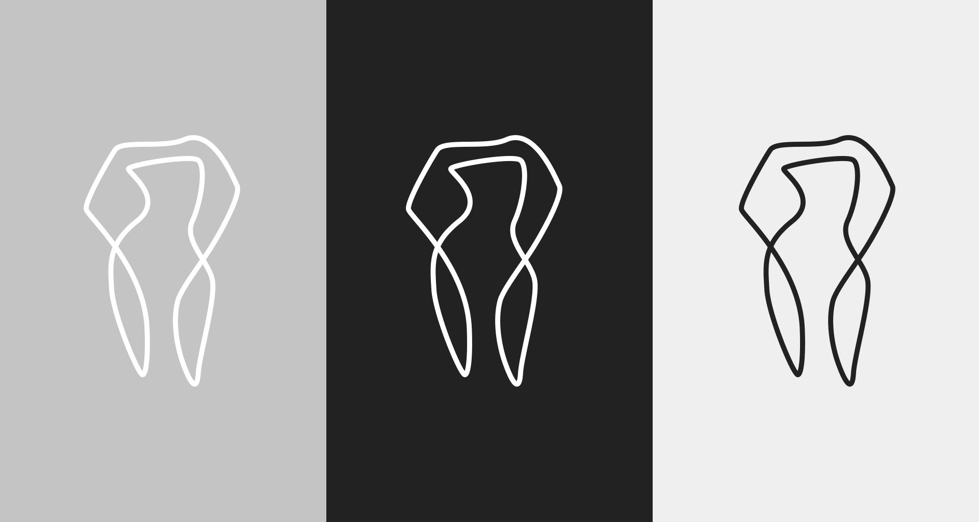
The design approach of the logotype, using a single line –without a start or an end- to depict the tooth shape, manages to combine the total care provided by the team including all fields of dentistry. Meanwhile, the organic form of the design reflects the artistic nature of the team director, Petros Theodorakis, and manages to stand out in a design saturated branch of stylized solutions.
The intense palette of two “clinical” colors, provides enough contrast, printed with Pantone inks on off-white Munken Polar paper.
Moreover, a premium version of business cards was designed, in a more earthly colored palette.
Munken Polar and Papago Stone papers were laminated, and the logo was embossed on one side with a metal cliché.
_ VISUAL IDENTITY _ LOGOTYPE _BRANDING